Histogram of relative frequency and empirical cumulative distribution
Table of Contents
Table of Contents
Are you struggling with drawing a cumulative frequency histogram? Don’t worry, you’re not alone! For many students and professionals, creating this type of graph can be a daunting task. But fear not, in this article, we’ll go over the basics of how to draw a cumulative frequency histogram step-by-step, so you can create professional-looking graphs in no time.
The process of drawing a cumulative frequency histogram can be overwhelming, especially if you’re not familiar with the terminology or where to begin. It can be easy to get lost in the steps or become disheartened by the number of calculations you have to make. But with patience and practice, anyone can create this type of graph.
Before we get started with the process, let’s first define what a cumulative frequency histogram is. A cumulative frequency histogram is a graph that shows the cumulative number of times a value appears in a data set. It is similar to a histogram, but instead of showing the frequency of each value, it shows the frequency of all values less than or equal to a certain value.
To draw a cumulative frequency histogram, follow these 5 easy steps:
Step 1: Organize your Data into Classes
The first step in creating a cumulative frequency histogram is to organize the data into classes. Classes are ranges of data values that are grouped together. Each class has a lower limit and an upper limit, which helps to organize the data in a meaningful way. For example, if you have a set of test scores ranging from 50 to 100, you can group the data into classes of 10, such as 50-59, 60-69, 70-79, 80-89, and 90-100.

Step 2: Determine the Frequency of Each Class
Next, you need to determine how many data points fall into each class by finding the frequency of each class. This can be done by counting the number of data points that fall within each class range.
Step 3: Find the Cumulative Frequency of Each Class
After finding the frequency of each class, the next step is to calculate the cumulative frequency of each class. The cumulative frequency of a class is the sum of the frequencies of all the classes below it, including itself.
Step 4: Draw the Histogram
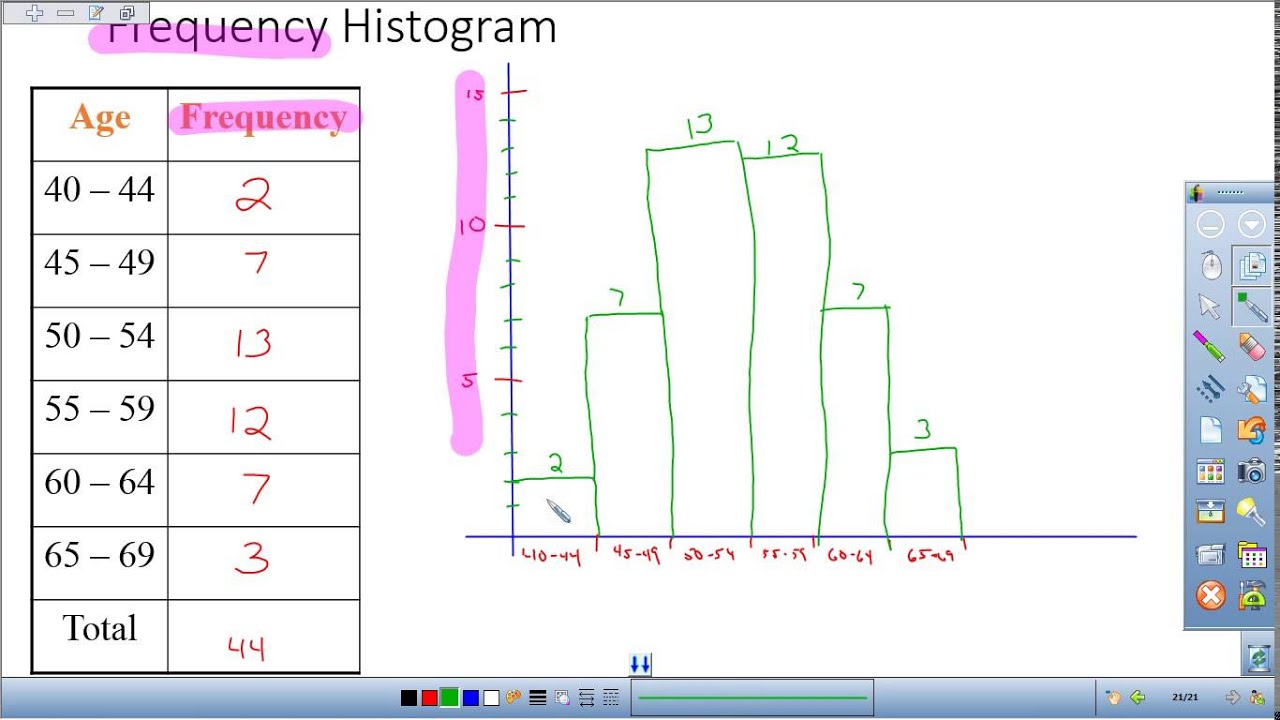
The fourth step is to draw the histogram. Start by drawing a horizontal axis that represents the range of the data (the minimum and maximum values). Then, draw a vertical axis that represents the frequency or the cumulative frequency of the data. Draw a rectangle over each class interval, with the height of each rectangle equal to the frequency or the cumulative frequency.

Step 5: Draw the Cumulative Frequency Polygon
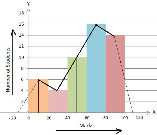
The final step is to draw the cumulative frequency polygon. This is done by connecting the midpoints of the tops of each rectangle in the histogram. The result is a line graph that shows the cumulative frequency of the data set.
Common Mistakes to Avoid When Drawing a Cumulative Frequency Histogram
Now that we’ve gone over the steps to create a cumulative frequency histogram, let’s take a look at some common mistakes that people make when drawing this type of graph.
One mistake is forgetting to label the axes. It’s important to label the horizontal and vertical axes with the appropriate scales and units. This helps to make the graph clear and understandable.
Another mistake is forgetting to include a title. The title should reflect what the graph is showing, and it should be clear and concise.
Lastly, make sure to choose an appropriate class interval size. If the class intervals are too small, the graph will have too many bars, making it difficult to read. If the class intervals are too large, the graph will have too few bars, making it difficult to see the distribution of the data.
FAQs About How to Draw a Cumulative Frequency Histogram
Q: What is the difference between a frequency histogram and a cumulative frequency histogram?
A: A frequency histogram shows the number of times that each value appears in the data set. A cumulative frequency histogram shows the number of times that values up to a given value appear in the data set.
Q: How do you calculate the cumulative frequency?
A: The cumulative frequency is calculated by adding up the frequencies of all the classes up to and including the current class.
Q: Can a cumulative frequency polygon be drawn without having a histogram?
A: Yes, a cumulative frequency polygon can be drawn without a histogram. However, it’s usually easier to draw the histogram first and then draw the polygon based on the histogram.
Q: What is the purpose of drawing a cumulative frequency histogram?
A: The purpose of drawing a cumulative frequency histogram is to understand the distribution of the data set. It allows you to see how many values fall within a certain range and how the distribution is skewed.
Conclusion of How to Draw a Cumulative Frequency Histogram
Now that you know how to draw a cumulative frequency histogram, you can start creating graphs to analyze data more effectively. Remember to organize the data into classes, find the frequency and cumulative frequency of each class, draw the histogram, and finally, draw the cumulative frequency polygon. With a little practice, you’ll be creating professional-looking graphs in no time!
Gallery
Histogram Of Relative Frequency And Empirical Cumulative Distribution

Photo Credit by: bing.com / histogram relative cumulative empirical
Ogive Graph / Cumulative Frequency Polygon In Easy Steps

Photo Credit by: bing.com / cumulative graph ogive frequency histogram relative polygon draw easy percent class add steps decimal step
Histograms And Relative Frequency Histograms In Statistics - YouTube

Photo Credit by: bing.com / frequency relative histograms statistics
How To Draw A Histogram From A Frequency Table

Photo Credit by: bing.com / histogram frequency polygon draw help method table math distribution examples constructing histograms steps
Drawing Cumulative Frequency Histogram Polygon

Photo Credit by: bing.com / frequency cumulative histogram polygon


